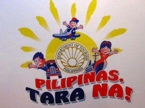
Are they serious about this?
Just a quick punch list of my objections.
Why promote the “Department of Tourism” so prominently? If we don’t need to put the Philippine flag or even flag iconography on the logo (which we do not), there is even lesser reason to put up the logo of a mere instrumentality.
It’s a new invention called the google.

The idea, of course, is that it’s the country that is promoted. Not the Department of Tourism.
The font is as bland as a five-hour old bubblegum. I bet someone out there can even find this exact same font as a free download somewhere on the internets. This particularly annoying because it smacks of laziness. It’s not like an entirely new font has to be developed. It’s just eight letters and one punctuation mark!
FYI, Neil Gaiman once dissed Marvel Comics for being cavalier about the lettering for a story he wrote for them. If I’m not too mistaken, he said something about wanting to get Todd Klein for the job even if he had to pay for Klein’s services himself (for those who don’t know, Todd Klein is the letterer for the Sandman series). Details like typography matter. The makers of the Tara Na logo apparently don’t think so.
These images look like they were lifted from some public school wall mural. No really. Look at those cartoon faces. To be honest, I was surprised they didn’t use faceless heads. The simplicity is not the issue. The simple-mindedness is. As with the font, the cartoon faces just do not strike one as being well-thought out.
With the last logo, the creators – despite outwardly “apologizing” – snidely scored the public for allegedly not understanding marketing principles and not understanding that we, the people, weren’t meant to like it because it was the foreigners who’s opinions mattered. I’d like for them to say that with this logo.
Even assuming that this logo is intended to promote domestic tourism only, do they seriously think that a public steeped in Asian pop culture will respond to images of children who probably would have looked better if they’d been drawn in barong tagalogs and ternos, dancing the tinikling in some Grade III reader’s depiction of a barrio fiesta.
However, to be perfectly fair, it is quite possible that the creators want to move in the direction of Asian countries that use cutesy cartoons for their promotional materials. Taken in that light, the use of cartoons is probably kosher, but still, I have to wonder.
Knowing how government plantillas look like, I would not be surprised if this logo was outsourced to a PR firm. Which means that the easy conclusion (that we “obviously have a long way to go before we can come anywhere near our Asian neighbor’s ability to cute-ify even teapots”) can’t be justified. Our PR firms, after all, are among the best and trendiest in the world. So, why the amateurish work?
The slogan sounds domestic. I know a lot of people have commented that the slogan is incomplete (Tara Na! …. where?), but I respectfully disagree. Obviously, “tara na” invokes the spirit of adventure and leisure travel. It’s certainly a common enough expression. In fact, the use of “Pilipinas, Tara Na” is what makes me think this is intended to promote domestic tourism more than anything else. It speaks to “Pilipinas,” and not anyone else, in which case it isn’t incomplete.
Having said that, the blandness of the slogan still betrays a lack of respect for the Filipino. Do they really think such a rustic approach will pique the interest of the travel-for-leisure public? Based on my meandering experience, that market is as sophisticated as any in the world. I have no doubt that these people would respond better to come-hithers from Singapore anyday.
Over-all, this logo looks like it was slapped together to meet a deadline; no thought seems to have been invested in it; and the logo seems to me to be a cop-out. All of this, to me, betrays a serious disregard for the sensibilities of the people it is supposed to represent.
#justsaying

